Mentor Me Collective
My Role
UX UI | Visual design | User research
Team
Sophia H. Graphic designer , Shodie L. UX Designer
Timeline & Status
2024, 2 months
Overview
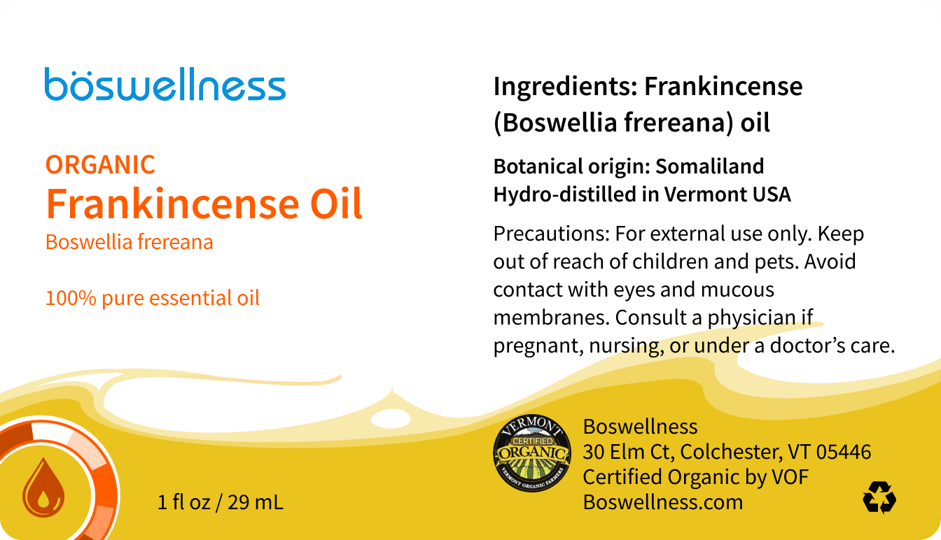
At Boswellness the goal is to provide customers with a sustainable yet approachable label redesign that enhances their visual identity.
How it all started
User testing on the previous website revealed recurring pain points that significantly impacted the user experience. Notably, users frequently struggled to locate critical sections, such as Referrals and Lifestyle. This issue was compounded by a navigation structure that lacked clarity, resulting in frustration and decreased engagement with these essential features.
Benchmarking against similar websites highlighted that many competitors faced similar challenges in organizing content-heavy platforms. However, some had begun implementing streamlined navigation solutions to improve discoverability and engagement. Despite these efforts, we noticed that many approaches felt overly complex, catering to power users while leaving less technical audiences behind.
Armed with these insights, our goal became clear: to design a navigation system that was intuitive, accessible, and scalable. By prioritizing simplicity and minimizing friction, we aimed to create a user experience that allowed visitors to effortlessly explore the website’s offerings while keeping future expansion in mind. Our solution sought to reduce cognitive load and ensure that key sections, like Referrals and Lifestyle, were prominently featured without overwhelming the user.

Framing the Challenge
Initially, our research aimed to understand general user behaviors and preferences around online shopping. However, as we conducted extensive surveys, it became clear that users had distinct priorities that shaped their shopping experience. These included the need for secure payment options, seamless navigation, and personalized recommendations to streamline decision-making.
While these insights provided a strong foundation, user feedback also revealed gaps in existing platforms, such as inconsistent security features and overly complex interfaces. This growing awareness pushed us to prioritize designing a user-friendly experience that addressed both functional needs and emotional drivers, ensuring that the platform felt intuitive, trustworthy, and tailored to individual users.
Outcome
The redesigned website introduced a streamlined and user-centric navigation system, making it easier for users to discover and engage with critical sections like Referrals and Lifestyle. By implementing clear menu structures and strategically placed call-to-action buttons, we simplified user journeys and minimized friction.
This approach not only improved the overall usability but also significantly enhanced engagement metrics for previously overlooked sections. Drawing inspiration from user feedback, we prioritized accessibility and ensured that the design could adapt to future content expansions without compromising its simplicity.
From a business perspective, the redesign delivers strategic value by increasing user retention and encouraging deeper exploration of the site’s offerings. By addressing user pain points and elevating their experience, the website is now better positioned to meet client objectives and establish itself as a benchmark for usability in its category.
Like what you see?
Feel free to contact me at: harvey.l.soph@gmail.com


