Boswellness Labels
My Role
UX UI | Visual design | User research
Team
Sophia H. | Graphic designer
Timeline & Status
2024, 2 months
Overview
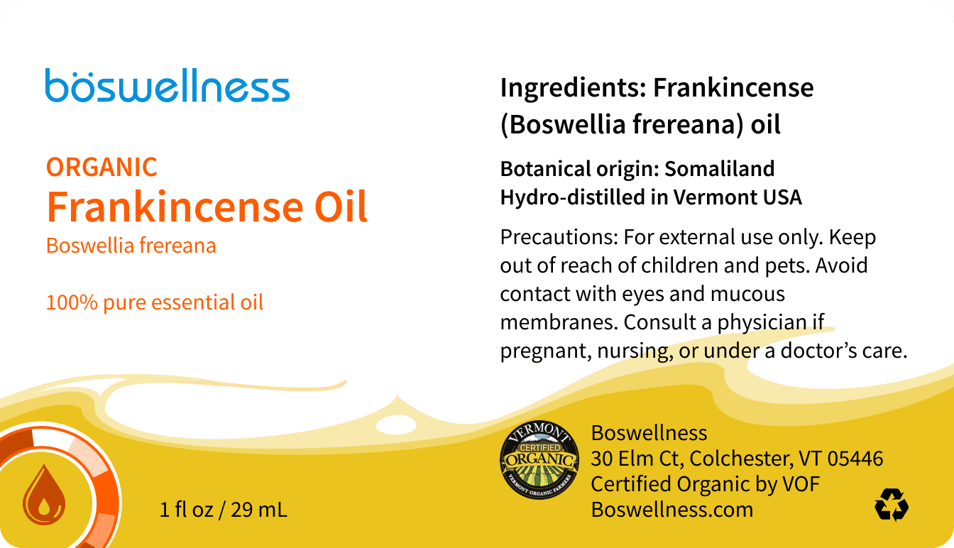
At Boswellness the goal is to provide customers with a sustainable yet approachable label redesign that enhances their visual identity.
How it all started
Boswellness, an established brand, sought to refresh their labels to stand out more in a competitive market. To kickstart the rebranding process, my teammate and I first explored the strengths of the existing labels and identified areas for improvement, laying the foundation for a design that truly resonated with their audience.
Process
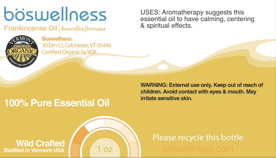
When starting the process it was important to establish what were the pros with the old labels and what did not work as well for the labels.
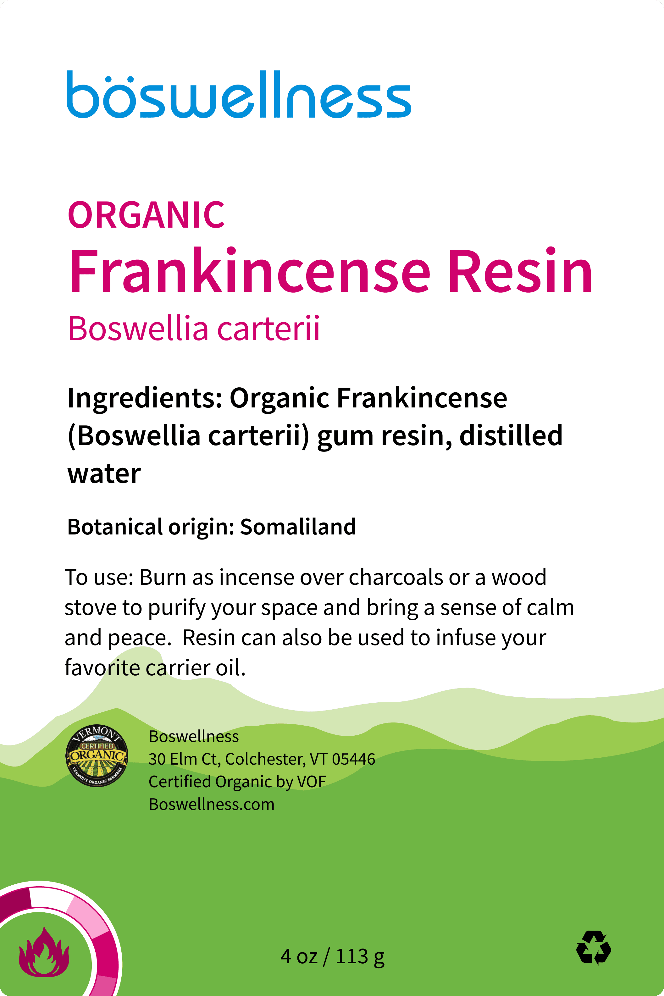
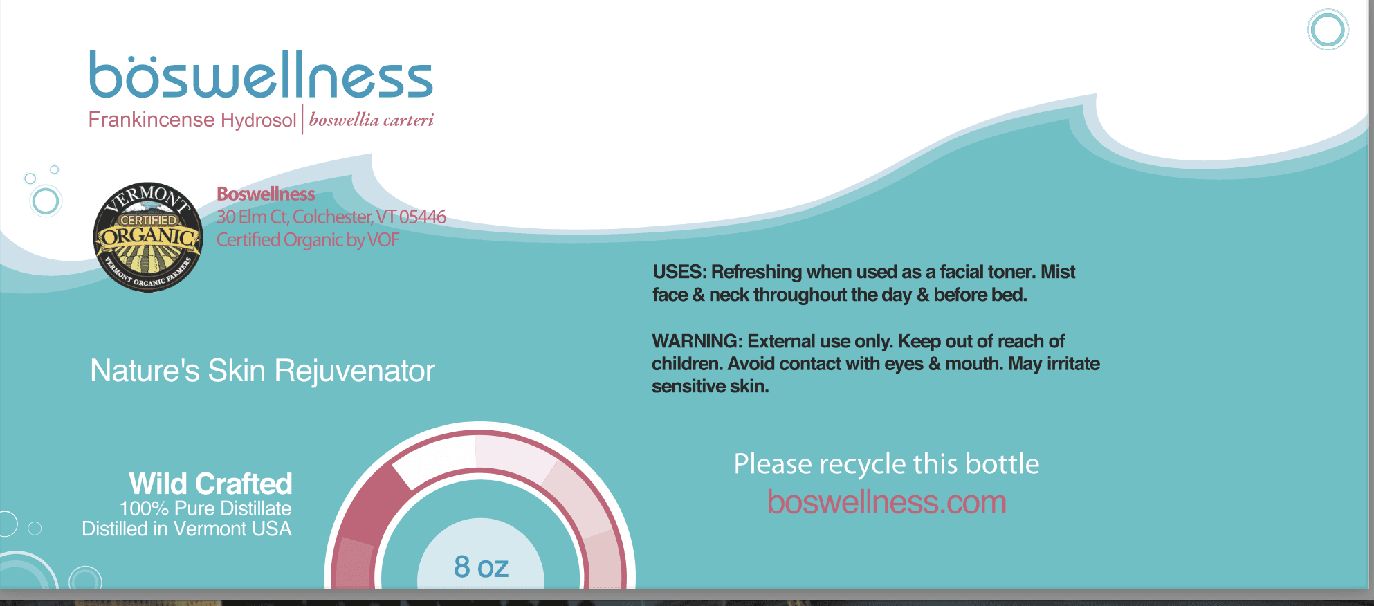
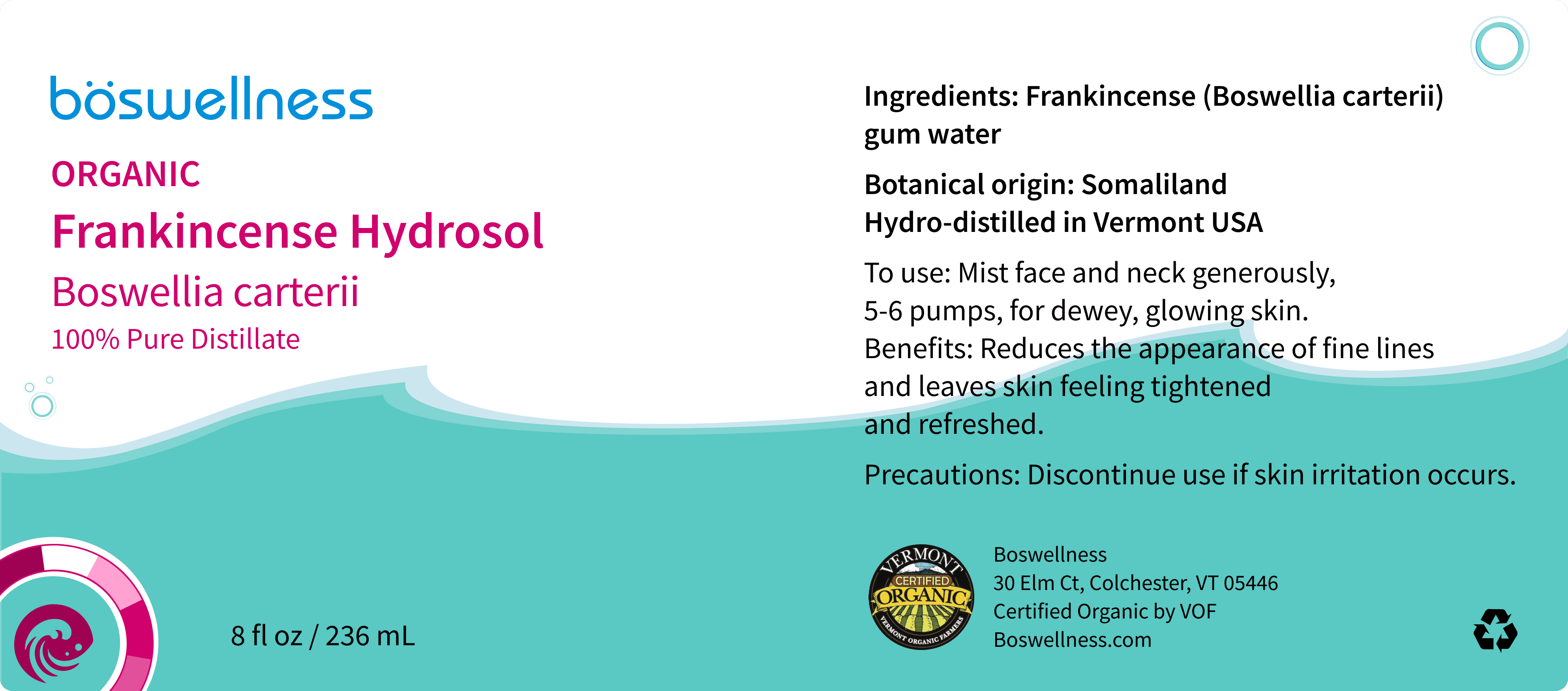
The founders wanted for there to be consistency with their old labels. They also wanted the wheel, oil, FDA compliance, and the placement to be changed.
The recommendations that I gave was to bold the most important text, lowering the wave, and accessibility were the most dynamic points. The bolded text was recommended due to consumers knowing quickly what a product does. Lowering the wave on this label was due to the label being a smaller size and it allows the text to breathe. Text should be readable for all consumers
Takeaways
The placement of items on the labels is very important. Consumers want to be able to access what they need quickly.
Color choice is important because of accessibility. Labels are meant to be read and it's vital for users to be able to quickly scan them.
Font choice is just as important. By using the same font family it is more readable for consumers.
Like what you see?
Feel free to contact me at: harvey.l.soph@gmail.com
